
Michael Simeone, Christopher Morris, Kenton McHenry, and Robert Markley
The study of historical maps as a group or body poses interpretive challenges on a number of fronts: maps are representations of geophysical spaces, and yet they are also works of art, produced, exchanged, and viewed within the commercial and sociopolitical contexts of the cartographers’ time and culture. They can combine the best current geographical information available with fanciful speculation or with deliberate distortions to promote particular political views or to obscure valuable information from commercial and political rivals. They tend to conform to the professional and aesthetic conventions of the day, but they can also flout them. They are almost always commodities produced for sale or to please sometimes very wealthy and powerful patrons. The balance between informational, artistic, professional, and commercial content—and there may be more categories of content to consider—varies from map to map. In brief, the complexities of each map require sustained examination as well as individual consideration. But individual inspection, while helping to account for the contingencies of historical maps, does not lend itself to noticing broader patterns in a larger map collection. Digitizing maps can allow scholars to inspect and compare many maps at a time, as they can be arranged in tiles or sequences to aid human comparison. But even this approach cannot scale to hundreds of maps. The transformation of many individual images into a single clean and quantifiable dataset, then, can enable analysts to discern trends and tendencies that are otherwise obscured by the idiosyncrasies of each individual image. However, computational approaches produce their own problems when the complex, ambiguous, and qualitative representational purposes of individual maps—far from receding in the body of data—persist and confound the procedures of quantitative study.
Through our examination of the shorelines of the Great Lakes depicted in historical maps, this article examines some of the advantages and problems arising when we combined humanistic and data-driven research methods. In this case, we tried to make sense of the visual variations found across a wide corpus of maps of the Great Lakes by identifying useful trends relevant to the study of the historical climatic and environmental conditions of the region. This was not a straightforward act of measurement and analysis. Our data, how we analyzed it, and what we made of it was always challenged by a recognition of the varying ways art, politics, science, and commerce affected each map. As such, this article highlights a process of interpretation that oscillates between conventional visual analysis of maps and their computational study.
In outlining the history and results of this project, we discuss both the value and the epistemological limitations of applying computational and quantitative approaches to eighteenth-century cartography and the problems that arise from the segmentation and measurement of irregular objects such as lakes. Our experience, we believe, suggests some of the ways that advanced computing can enrich—and complicate—approaches to the art and science of cartography.
Project Summary
This project began with the hypothesis that an environmental or climatological unconscious could be drawn out of historical maps. Patterns relevant to climate or the environment, while latent, could be extracted by measuring maps in large numbers. The work began as part of a collaborative grant—Digging Into Image Data to Answer Authorship Related Questions—jointly funded by NSF/NEH/JISC.[1] The grant focused on developing computational methods to distinguish “authorship” across three visual datasets (historical maps, American quilts, and fifteenth-century manuscripts), with a team devoted to distinguishing between French and British cartographic traditions. The initial results from a small dataset of 40 maps of the Great Lakes served as the basis for a subsequent project, sponsored by an Institute for Advanced Computing Applications and Technologies (IACAT) Fellowship (2012-13) that analyzed a larger dataset in order to explore previously unexamined connections between the art of map-making before 1830 and depictions of short-term weather patterns and longer-term climatological conditions at the end of the Little Ice Age.[2]
Working with the Senior Investigator, Robert Markley, two collaborators, Michael Simeone and Kenton McHenry, developed a super-pixel approach to analyzing a database compiled from 237 maps of the Great Lakes, published between 1680 and 1830. The maps in our database had been scanned by other institutions and individuals at high (300dpi) resolutions and were freely available; and our two-step process of 1) computationally identifying lake shapes and measuring the square mileage within those shapes; and 2) analyzing that data as a body, rather than analyzing each map individually, allowed us to study features and patterns that either varied or persisted across our data that we could not have undertaken solely by visual comparison of individual maps. In the original IACAT proposal, we hypothesized that we could discover encoded in the body of maps evidence of both short-term weather events (for example, colder conditions and increased ice cover in the aftermath of the eruption of Tambora in 1815) and longer-term climatological conditions during the Little Ice Age (c. 1400-1850). But our subsequent collaboration with environmental historian Christopher Morris complicated, without invalidating, this hypothesis. Water levels in the Great Lakes are sustained primarily by precipitation rather than by in-flowing rivers. These levels, particularly in Lakes Huron and Michigan, vary in 30- to 40-year cycles by three to five feet; long-term cycles of variability extend to roughly 160 years.[3] In brief, climatic conditions over a 200-year period are difficult to chart on individual or small samples of maps, but may emerge, as we discuss below, in complex patterns revealed in the study of specific geographical features, such as Manitoulin Island located in Lake Huron, that seem particularly sensitive to changes in water levels in some parts of the lakes. We discovered, then, that our initial goals—automating the computational analysis of distinguishing features and patterns in order to identify and study latent trends—were subject to a host of ontological and epistemological problems about the objects we were studying and our methods of analysis. If scalability and the broad applicability of our approach to image analysis allowed us to ask new questions about cartography and climate, those questions continually had to be refined to address the data revealed by the methods we employed.
Our computational analysis of the maps led us to focus on human inspection of the northern lobe of Lake Huron as potentially the most climatologically sensitive: variations in coastlines and specifically the seemingly arbitrary depictions of Manitoulin Island as either a single long island or a chain of islands may represent cartographic evidence of changing climatic conditions as well as the practices of individual cartographers. The more successful and revealing the computational analyses of maps as a body of big data became, the greater our need to examine each map individually. Quantitative, algorithm-driven analysis, in other words, can supplement but not replace the analytical methods of historical cartographers and art historians.
Certain important qualities of the map collections we analyzed made them resistant to straightforward automated analysis. The quality of paper and its absorption of ink, for example, can affect the measurement of individual regions. Because most of the travel through the Great Lakes region before the 1830s was by boat or canoe, mapmakers in general tended to represent rivers as wider and more prominent than they likely were. The maps we used for our analysis were produced by cartographers in France, Britain, and later the United States between 1680 and 1850; some appeared in atlases, others as single sheets. The people who drew maps or sketched them for publishing concerns in England, France, and later the United States included missionaries, fur traders, adventurers, military men, surveyors, and professional and court cartographers, who represent different national traditions of exploration, trade, and relations with indigenous tribes. Different maps could serve different purposes, even when they were engraved and published by the same cartographer. Some made maps based on firsthand information, but some of the mapmakers in Britain and France engraved impressions of lakes they never saw.[4]
If the maps were intended to convey geographic information in visual form, they also worked to be aesthetically pleasing and visually convincing. Publisher John Bowles advertised a collection of maps by Herman Moll as “correct, entertaining, and historical.”[5] At least some cartographers aimed for a kind of artistic palatability at the expense, perhaps, of what they understood to be strict scientific accuracy. Idiosyncrasies of color palette, the shading of coastlines, and the relative sizes and shapes of lakes and islands drawn with thin, hard, or fuzzy lines reflect the distinctive traits and skills of particular artists and engravers as well as, in some cases, the corporate styles developed by map-houses to suit specific aesthetic and commercial interests or to establish a trademark look. In practice, the representational motives and strategies of mapmakers are entangled in complex political, economic, and strategic considerations, making it difficult to identify individual maps as serving particular artistic or scientific ends. Even as our computational analysis of this corpus of maps allowed us to see beyond their surfaces, the data we extracted did not stand on its own. While some variations can be explained by sociopolitical and economic considerations, such as the imperial rivalry between Britain and France in North America, other apparent anomalies or inaccuracies require more complex explanations.[6]
Data and Methods
Maps
The maps in our dataset came from two sources: the Map and Geography Library at the University of Illinois (Urbana-Champaign) and the David Rumsey Map Collection and Database. The research team worked with digital content creation specialists to scan the physical maps from the UIUC Library holdings. Maps from the Rumsey Collection (now housed at Stanford University) are freely available online (https://www.davidrumsey.com) for public download. We selected only those maps by British, French, and US cartographers (1680-1850) that represented at least one of the Great Lakes, and we excluded global or continental-scaled maps because they frequently lacked sufficient detail and anomalies in lake shapes and coastlines were likely to skew our results.[7]
As one of three teams in the DID Grant, we faced a computational challenge in consistently distinguishing between the visual conventions and cartographic norms that characterized the British and French map-making traditions. While color choices, patterns, and shapes of figures proved valuable for the other teams working on manuscript illustrations and quilt collections, these criteria were less useful in distinguishing among similar features represented on maps. We began, then, by making two methodological decisions: to develop a robust method to measure the surface area of each of the five lakes in terms of square miles, and to use twenty-first-century knowledge of the lakes’ sizes and geographies as an objective standard to chart the maps’ changes in accuracy over 150 years. Our goal was to compare the increases (or decreases) in accuracy over time between French and British maps to see if we could develop a computational approach to identify a hypothetical map as belonging to one or the other national cartographic traditions. The decision to try to measure the area of the lakes in square miles—agreed to by both humanists and scientists on the team—was based on the idea that this method would tend to smooth out local or idiosyncratic variations: if an inlet or island on a given map was too small or large, or a shoreline was drawn with a thin or thick line, there was a roughly equal chance that another feature would be exaggerated in an unintentionally compensatory way. Errors in aggregate, we hoped, would tend to cancel each other out.
Segmentation
Our first task was to develop a computational approach to identify the shorelines of the lakes included in our database; shorelines had to serve as unambiguous boundaries for the shapes that we could then measure. The process of separating an image from its “background” is known as segmentation. But this initial step proved to be a major challenge. Each map varied in its shading, detail, colors, and use of territorial demarcations. One map might detail at the finest possible resolution the variations and inlets of a given shoreline, but another might take a more holistic approach by representing the same coastline as a comparatively straight or curved line. Confronted with the many idiosyncrasies of the individual maps, we developed a method of mining them uniformly (Fig. 1). The act of measuring became an interpretive act of establishing parameters that, in turn, required an epistemological justification for both local and methodological decisions. Is it appropriate to consider inlets as part of the surface area of a lake, even if enough of them could affect the overall measurement of its surface area? Or should our tracing of the coastlines smooth out variations by treating the lakes as more regular shapes? On almost every map in the dataset, rivers feed into the lakes, and the lakes are connected to one another by narrow waterways. For the purposes of identifying discrete lake shapes through image analysis, where does one lake end and another begin?
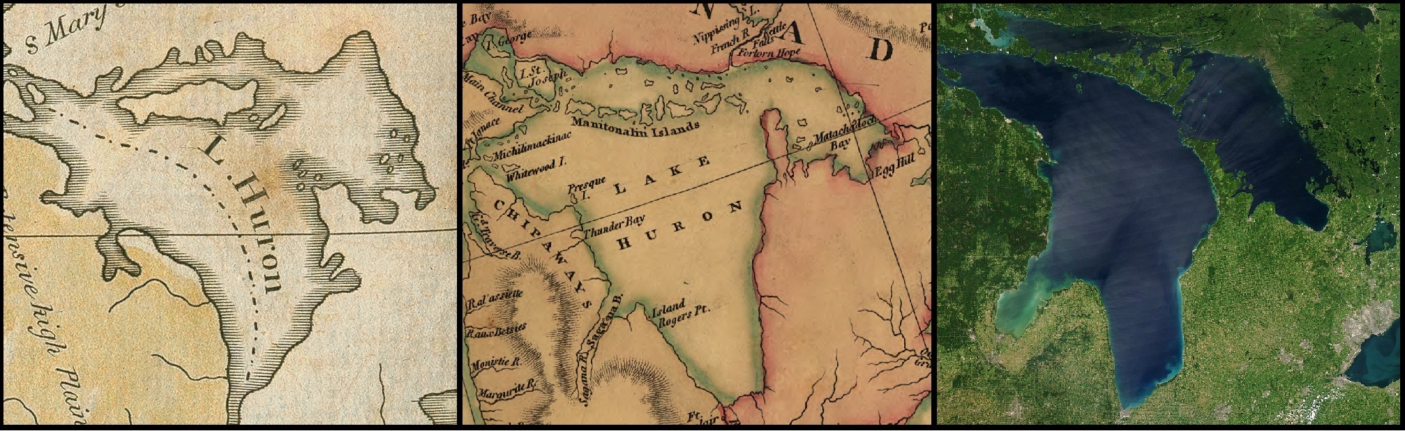
Fig. 1. Lake Huron as rendered with different features in two maps and a satellite view.
LEFT: Matthew Carey, The United States of America, 1796. University of Illinois at Urbana-Champaign. Historical Maps Online. Courtesy of the Map Library at the University of Illinois at Urbana-Champaign. CENTER: Aaron Arrowsmith, A Map Exhibiting All the New Discoveries in the Interior Parts of North America, 1802. Library of Congress Geography and Map Division Washington, D.C. RIGHT: NASA image by Jeff Schmaltz, MODIS Rapid Response Team, Goddard Space Flight Center.
Almost invariably, coastlines are represented by solid black lines, but they are also typically shaded in soft tones of blue or red that on pre-1850 maps enhance an aesthetic sense of depth. These shadings effectively shrink the size of lakes by lining the coasts with visual boundaries. The algorithms had to detect the difference between pixels on one side of a coastline and pixels on the other. Complicating matters, many maps featured national and territorial boundaries drawn through the lakes. These lines, while visually distinct from shorelines, can confound image segmentation algorithms. We found that some runs seemed to segment only half of a given lake, mistaking a boundary line for a coastline. In this case, political demarcations highlighted the methodological quandaries that could produce ambiguous or erroneous data.
Over the course of two grants, we experimented with three approaches to address these challenges: 1) manual tracings of the coastlines; 2) a ball segmentation algorithm; and 3) a superpixel algorithm. Manually tracing the coastlines entailed digitizing a hand-traced outline of the lake using IM2Learn software developed at the National Center for Supercomputing Applications (NCSA).[8] The ball segmentation algorithm iteratively runs a circular template of a given radius across each pixel of the map and checks for detected edges at its boundary. The algorithm has the effect of acting as a kind of eraser removing small unconnected edges, which are likely noise, and leaving larger continuous areas, ideally lakes in this case, as its output.[9] Both the tracing and ball segmentation methods (developed during the DID grant) struggled to produce results that were consistent and efficient. The ball segmentation algorithm, while capable of separating rough shapes of lakes from the rest of the map images, did not render these shapes as precisely as hand drawing, and required constant adjustment of threshold values (the radius of the circular template) by a human supervisor. Yet even tracing the lakes by hand, by far the slowest method we tried, produced its own difficulties: the human analyst had to mimic the skill of the cartographer to get as precise a segmentation as possible. These cutoff shapes, however, did not resolve key questions about variations in coastlines: do they represent perceived geographical features, or a debt to artistic and cartographic conventions?
During the tenure of the NCSA grant, we turned to the Felzsenwalb, et al superpixel method, an algorithm that calculates the similarity of pixels to one another based on color, texture, and other visual characteristics, dividing the image into sections or superpixels.[10] This approach was developed to over-segment an image, breaking groups into multiple superpixels, as opposed to under-segmenting an image, merging multiple segments together, under the assumption that it is easier to correct over-segmentations in a post-processing phase. The human supervisor operated a sliding scale that adjusted a single segmentation parameter to regulate the number of pixels into which each image was divided. The user then selected the pixel(s) that captured the lake in question as the lake shape to be measured. The final step in the process entailed determining the number of pixels per mile based on degrees of longitude and latitude in the neatline on the border of the map, or on the printed scale if one were present. The human supervisor had to approve the segmentation for each map to ensure that the superpixel process did not (for example) treat the borderline between the U.S. and Canada as a coastline. In this respect, the automated processing of maps still required a human operator in the loop.
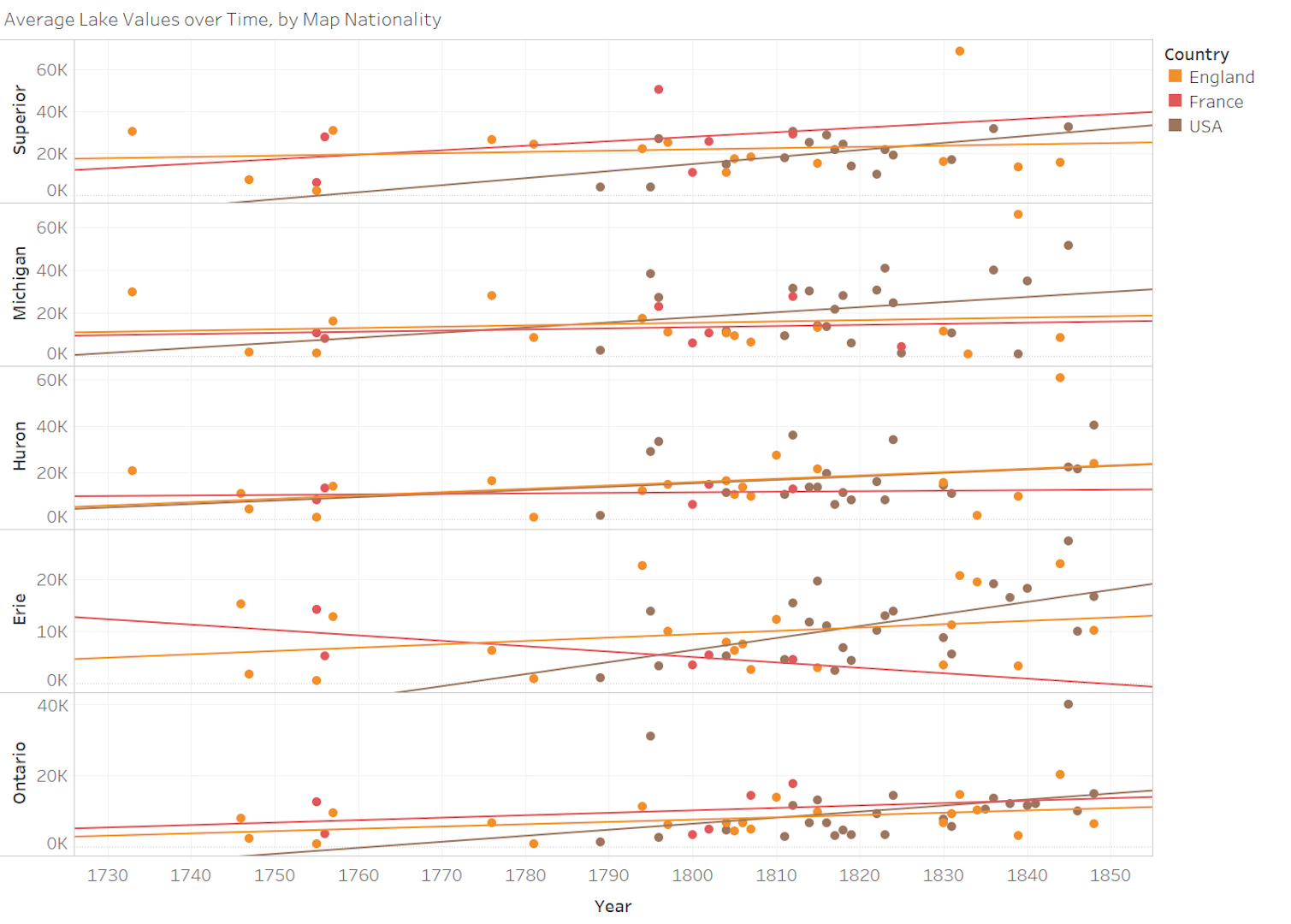
Fig. 2. Calculated areas of each of the Great Lakes as they appear on maps between 1730 and 1850, derived from superpixel segmentation with each colored circle representing a single lake shape on an individual map. Chart created by Michael Simeone using Tableau.
The superpixel approach allowed us to calculate the represented square mileage of each lake shape; we then plotted the values for each lake on each map organized by the date of publication. For the sake of this study, we filtered our results to consider only French, British, and U.S. maps made after 1730. Fig. 2 shows these values for each of the five lakes on individual maps. We also calculated the error rate of each map determined by the present-day square mileage of the five lakes, using Environmental Protection Agency measurements.[11] Fig. 3 shows these error rates over time, separated by lake. In both cases, we averaged values that were published in the same years. We also computed linear regressions for each lake and for each series.
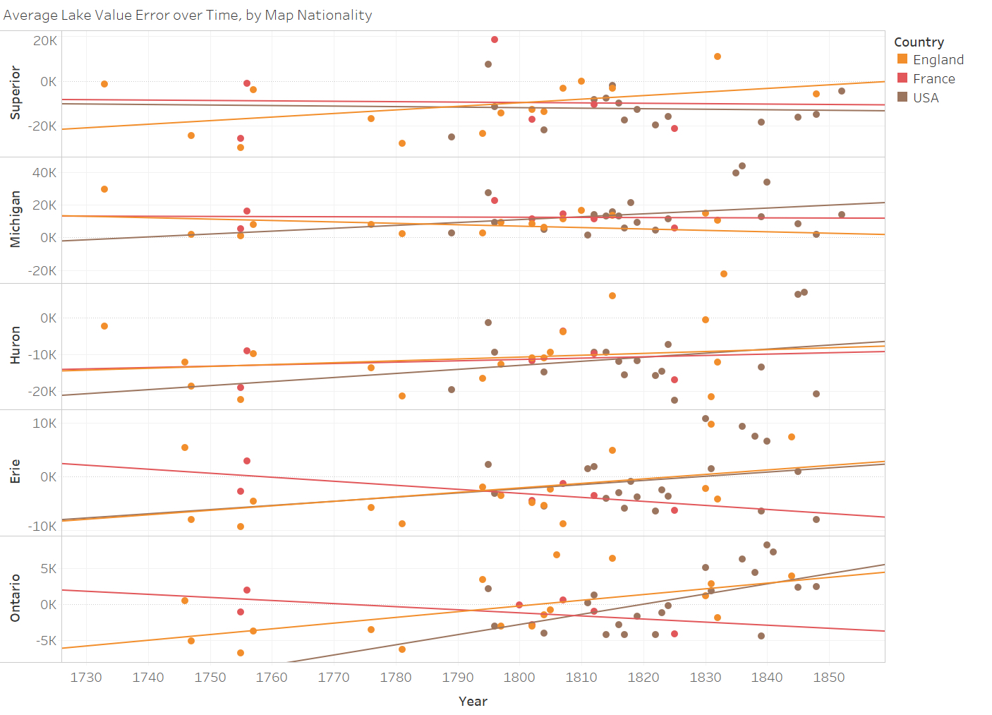
Fig. 3. Error rates between the superpixel segmentation data on the surface area of each lake and the 2011 EPA measurements. Trendlines indicate an attempt at a linear fit of the data. Chart created by Michael Simeone using Tableau.
Results
Our most significant finding, and one contrary to our initial expectations and to the received wisdom about progress in eighteenth-century cartography, is that we discovered no significant linear improvement in cartographic representations of the size of any of the Great Lakes between 1680 and roughly 1830. While U.S. maps seemed to conform to a linear trend of improvement more so than the French and British maps, there is nothing to suggest that a linear trend explains even half the U.S. maps.[12] Nor is there any appreciable linear improvement in the error rate in any of the lake series. If this were a case of persistent or repeated errors, we might have expected to find different cartographers making similar mistakes, but, by visually inspecting late eighteenth- and nineteenth-century maps, we found little consensus among mapmakers about the shape or size of Lakes Huron and Superior in particular. These challenges in segmentation analysis also made it difficult to explain the error rate of the segmentation algorithm. Our segmentation analysis of several mid nineteenth-century maps—a post-naval survey control group (Greenleaf 1848, Sharpe 1848, Smith 1852)—verified that our procedure could identify some high-quality maps as being quite accurate, but this alone was not enough to dispel all doubts about the reliability of our results. Additional computational work is necessary to assess how well our segmentation analysis actually performed, and we cannot at this time assess the viability of applying superpixel methodologies to other collections of historical maps.
Consequently, even if our tools were further refined, computational analysis faces several challenges in calculating the area of irregular geographical shapes. Image segmentation and size calculations have to assume that each pixel represents distance and space consistently. Areas of any illustration that are improvised, inconsistent, or embellished can undermine the assumption that all pixels represent the same area and consequently render measurements of individual lakes less accurate. A mapmaker might labor to render a section of a coastline—say, a strategically important bay or port—with painstaking attention to detail but be less concerned with precisely representing other, less economically or militarily significant stretches of the coastline. Given these inconsistencies and constraints, it may not be possible to develop ways to improve the accuracy of computational approaches to measuring this dataset of maps. Nonetheless, our analysis of these 237 maps did prove valuable in suggesting how a segmentation methodology may shed light on two neglected aspects of the historical cartography of the Great Lakes: the ways that mapmakers integrate new information into received ideas about the geography of the area; and the ways that what seem like anomalies or inaccuracies in maps may reflect changing climatological conditions, particularly during extended periods of unusual weather patterns.
The Manitoulin Maps: Cartographic Traditions and Anomalies
One of the most striking anomalies we discovered was the inconsistency in representations of Manitoulin Island. Although the island is clearly visible on each map, these inconsistencies have received little if any attention from scholars using traditional modes of analysis. However, Manitoulin’s many renditions stand out within our machine-read aggregation. 100 miles long, with an area of more than 1,000 square miles, Manitoulin is by far the largest of the several islands that separate Georgian Bay from the rest of Lake Huron. It is, in fact, the largest island in the world located in a lake. Manitoulin figured prominently in the earliest French and British maps, and was drawn with some consistency, if not to say accuracy, as a large, elongated landmass with a fairly regular shoreline. Then, abruptly in the 1790s, both French and British maps began representing Manitoulin as an archipelago of irregularly shaped islands, often labeled the “Manitoulin Isles” (Fig. 4). This reconfiguration persisted on maps until the modern surveys of the 1840s and 1850s, when the island appeared more or less as it does on present-day maps and nautical charts.
Although there are anomalies in the representations of other lakes, the cartographic significance of Manitoulin makes it a compelling case study.[13] We found that, in general, islands created problems for our segmentation algorithms, and these problems first drew our attention to Manitoulin. Our investigation of the differences in maps of an island, apparently ignored by historical cartographers, could not have been done without the kind of visual comparison enabled by digitized versions of the maps: we could zoom in on small segments of the maps, isolate features, and compare them. Our discussion below is based on dozens of maps that we compared.
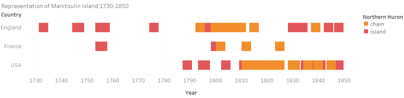
Fig. 4. Manitoulin Island in Lake Huron on maps from 1730-1850, shown as either a single island or as a chain of islands. Chart created by Michael Simeone using Tableau.
Many of the early French maps of the Great Lakes were produced by cartographers who had firsthand knowledge of the region (Fig. 5).[14] Samuel de Champlain’s 1616 map shows numerous Georgian Bay islands (known today as the Thirty Thousand Islands), including one larger than the others, which he canoed past and commented on in his journal. Bourdon’s 1641 map showed an indigenous settlement on Manitoulin, and in 1648 Jesuits established a short-lived mission among the Ottawas on the eastern end of the island. By the 1660s Manitoulin had taken on new significance, serving as a windbreak for French fur traders pushing west by canoe from Montreal into Lake Superior and eventually to the Saskatchewan River region.[15] In May 1670, Galinée canoed the length of Manitoulin as he passed through the North Channel, and made notes for the map he drew later that year, depicting an island of about 70 miles in length (Fig. 6).
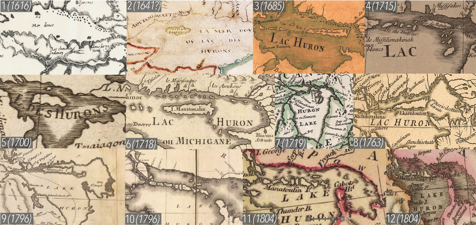
Fig. 5. Thumbnails of Manitoulin Island on French, British, and US maps, 1616-1814, drawn from the dataset of 237 maps. Image created by Christopher Morris and modified by Nancy Um using Adobe Illustrator.
A few years later, in 1688, Louis Lahontan set out from Sault Ste. Marie by canoe, and in four days made it to Manitoulin Island, which he described as “25 leagues long, and seven or eight broad.” He also produced an influential map.[16] Later map-makers, like the father and son team of Claude and Guillaume Delisle, never visited Canada, but culled 60 years of the Jesuit Relations to produce their celebrated map, “L’Amerique Septentrionale,” in 1700, revised and reissued several times over the next two decades. It depicted Manitoulin as a long island with an irregular shoreline,[17] a tradition followed by British cartographers, including Thomas Jefferys and Thomas Kitchin, in the 1750s.[18] After the conclusion of the Seven Years War and the transfer of Canada to British authority, travelers like Jonathan Carver and Alexander Henry offered firsthand descriptions of “an island that is remarkable for being near a hundred miles in length, and no more than eight miles broad” in Georgian Bay.[19]
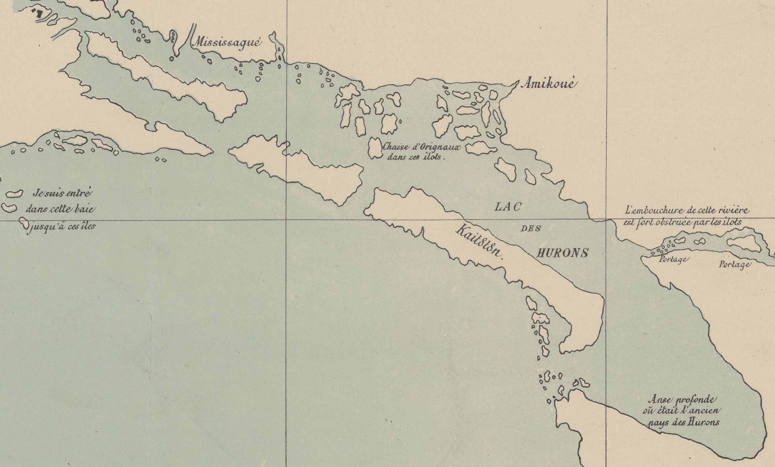
Fig. 6. Manitoulin Island, 1670. Pierre Louis Morin, Carte du lac Ontario et des habitations qui l’environnent. Ensemble le pays que M.M. Dolier et Galiné, missionnaires du Séminaire de St-Sulpice ont parcouru, (1670). Vraie copie (fac-similé) de l’original déposé aux Archives des cartes et plans de la marine impériale faite à Paris en May (1854) ([Reprod. en fac-sim.]) / Signé : P. L. Morin. Québec 1er juin (1880). Bibliothèque nationale de France, département Cartes et plans, GE C-3829.
If Arrowsmith’s maps of the “Manitoulin Isles” represented a clear break with a longstanding cartographic tradition, they also seem to have re-drawn the imaginative geography of Georgian Bay. However, Arrowsmith’s maps were hardly art for art’s sake and set standards in their day for accuracy. As one of his biographers puts it, “information from the Hudson’s Bay Company, the Admiralty, and private individuals was combined for the first time to give the most accurate map [of Upper Canada] possible. As more data became available the Canadian map plates were changed numerous times by Arrowsmith himself and each of his three successors, who all prided themselves on using only the most up-to-date information.”[24] Arrowsmith’s motivations for altering representations of northern Lake Huron are impossible to pin down with certainty, but we suspect climate change and weather events affected his perception of the islands, as we discuss below. In any case, that the question arose from our application of computational analysis to a large body of maps that included several by Arrowsmith is significant in its own right.
Having studied 200 maps of Lake Huron, we found ourselves in deeper epistemological waters than those delved into by segmentation analysis. We discussed a number of different ways to explain the fragmentation of Manitoulin into a chain of islands. Fur traders passing Manitoulin by canoe along the island’s north shore could not have sketched or reported with any accuracy the nature of the south shore. Yet on many of the early maps, both coasts of the island appear similar, as though witnesses assumed a representational symmetry: to see one side was to extrapolate the other. In fact, the north shore of Manitoulin is broken by large inlets and bays, while the southern coastline, by comparison, is more regular, particularly if one is looking to anchor a schooner or larger sailing vessel in a safe haven. Travelers’ perspectives, we assumed, would differ, depending on whether they saw Manitoulin from a canoe, low and nearby, or from a sailing vessel that kept its distance from a potentially treacherous shore. The north shore of Manitoulin (Fig. 7) easily could appear to be several islands from a canoe navigating the narrow passage of the North Channel.
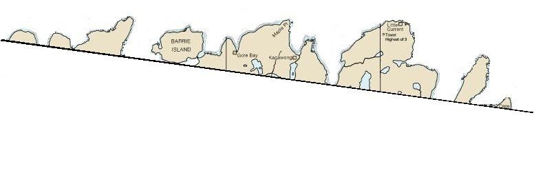
Fig. 7. Manitoulin Island, north shore from a 2013 map. National Oceanic and Atmospheric Administration (NOAA), Lake Huron Chart 14860 (2017).
Travelers seeing the southern shore of Manitoulin from a greater distance onboard a larger sailing vessel, common on Lake Huron in the final decades of the eighteenth century, would likely be struck by the scarcity of safe harbors and see the comparatively unbroken coastline as the shore of a single island (Fig. 8). This seemed a reasonable proposition except for the fact that the “Manitoulin Isles” appeared on maps and in firsthand accounts as more ships sailed past the southern coast of the island and canoe traffic through the North Channel declined as the fur trade gravitated to the Hudson Bay Company.
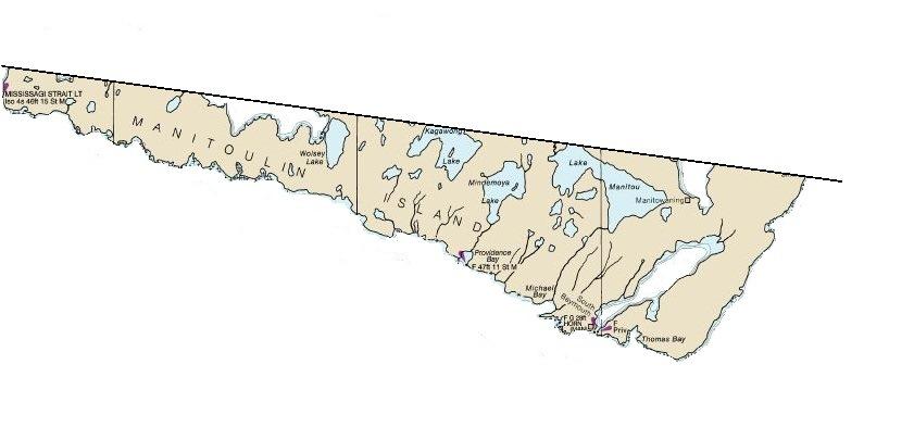
Fig. 8. Manitoulin Island, south shore from a 2013 map. National Oceanic and Atmospheric
Administration (NOAA), Lake Huron Chart 14860 (2017).
By the 1830s and 1840s, travelers’ accounts as well as new maps that drew on the Admiralty’s surveys once again reported a single Manitoulin Island. In his Historical and Descriptive Account of British North America (1840), Hugh Murray described “a range of islands” along Lake Huron’s “northern shore. . . . Among these islands the chief is the Great Manitoulin, seventy-five miles long.”[25] Maps of Lake Huron during this era become, by twenty-first century standards, far more accurate, and by the 1860s, detailed navigational charts mark water depths and shoals along Manitoulin’s rugged coasts.
The Manitoulin Maps: Climate and Cartography
A plausible explanation for the incompatible depictions of Manitoulin as either a single island or a chain of islands between 1795 and 1820 may lie in the climatological conditions that existed in the Great Lakes region during the period. Aaron Arrowsmith’s maps in 1796, 1802, 1812, 1814, and 1819 were published during some of the coldest and most anomalous decades in centuries. The volcanic eruptions in Iceland (Laki) in 1782, an unknown volcano in 1809, and the massive Tambora eruption in the Indonesian archipelago in 1815 produced chilling, often deadly, weather patterns across the northern hemisphere. The decades at the end of the eighteenth century were often unusually cold; between 1782 and 1786, temperatures dropped in central England and elsewhere in Europe to the coldest levels in a century.[26] The volcanic plumes of aerosol sulfates in years after the 1809 and 1815 eruptions reached the stratosphere, circled the globe, and cooled temperatures in the northern hemisphere by up to three degrees Centigrade, in the case of Tambora, for three years.[27] As a consequence, the decade between 1809 and 1819 was the coldest for the northern hemisphere in at least a millennium. While we do not want to claim these persistent patterns of cold weather led directly to new cartographic representations of Manitoulin, the “Manitoulin Isles” becomes the default depiction for the maps in our database through the 1820s. This is suggestive for several possible reasons.
For much of the seventeenth and eighteenth centuries, Manitoulin was at most a way station rather than a destination for fur traders. Describing his travels through the region, Carver wrote from Michilimackinac, situated to the northwest of Manitoulin, where Lake Huron and Lake Michigan meet, in early November 1767 that “the winter setting in soon after my arrival, I was obliged to tarry there till the June following, the navigation over Lake Huron for large vessels not being open, on account of the ice, till that time.”[28] Although canoes could travel Lake Huron more easily than Carver’s schooner, the northern stretches of the Great Lakes were ice-covered for at least six months a year, putting a premium on travelling as quickly as possible to the fur trading regions west and north of Lake Superior, and leaving little time to explore or chart Manitoulin’s coasts or the uninviting landscape in present-day Ontario, Wisconsin, and Michigan.[29] In 1820, on a canoe voyage from Detroit to Michilimackinac, the first leg of the Cass expedition to map the headwaters of the Mississippi, Henry Rowe Schoolcraft wrote “nothing can present a more picturesque or refreshing spectacle to the traveler, wearied with the lifeless monotony of a canoe voyage through Lake Huron than the first sight of the island of Michilimackinac, which rises from the watery horizon in lofty bluffs, imprinting a rugged outline along the sky, and capped with two fortresses, on which the American standard is seen conspicuously displayed.”[30] Schoolcraft reserves the language of the picturesque for a description of the beauty, prosperity, and military strength represented by the forts; the American flag serves political and symbolic functions in a narrative that repeatedly describes the shores of Huron and Michigan as “sterile” and “dreary”.[31] During the first and last months of travel in the region, typically May and October, variations in the water levels in the lakes and ice cover may have led travelers to reach different or ambiguous conclusions about where lake-ice ended and the shoreline began, or where low-lying wetlands gave way to solid ground.
Before the late 1820s, steamship travel was confined to Lakes Ontario and Erie, and much of the documentary evidence about the effect of the persistent cold of the Tambora years centers on the eastern regions of the Great Lakes. Nonetheless, newspaper and other accounts are intriguing. On May 23, 1815, water levels were the highest ever recorded to that time in Lake Erie, and during the following winters ice-cover persisted well into the spring. In 1816 several Lake Erie ports were iced in until May 14, and the following year, ships in Buffalo and Toronto did not began sailing until ice disappeared on April 29.[32] In the twentieth and twenty-first centuries, the North Channel between Manitoulin and mainland Ontario ices over earlier in the fall and remains ice-covered much later than all but a few inlets and bays in Lake Superior,[33] and it is reasonable to assume that in 1815-1817 Manitoulin was blockaded by ice until June. Unlike Erie and Ontario, however, Lake Huron was comparatively unknown territory. Drummond Island off the west coast of Manitoulin was surveyed for a naval station during the War of 1812, but, as the naval commander in Canada, E. C. W. R. Owen wrote in November 1815, “Of the navigation of Lake Huron, scarcely anything is known.”[34] Before Bayfield’s survey in 1819, the maps of Manitoulin reflect that uncertainty.
Ice cover, changing lake levels, and the difficulties of distinguishing between ice and land, water and wetlands, and wetlands and “solid” land may help account for the inconsistencies in the measured surface areas of Lakes Huron and Superior represented on the maps in our database. Manitoulin presents a particularly difficult case, a long limestone island cut by numerous inlets that in several places bring the northern and southern coasts within a mile or two of each. On modern satellite maps, Portage Lake (Fig. 9) is connected by a stream that drops only two meters in elevation along its two-kilometer length to Portage Bay on the southern coast of the island.
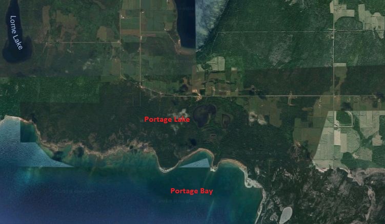
Fig. 9. Satellite image of Portage Bay and Portage Lake, south coast of Manitoulin Island.
Imagery ©2018 DigitalGlobe, CNES / Airbus, TerraMetrics, NOAA, Map data ©2018 Google.
Due south of Whitly Point on the eastern side of Meldrum Bay, on the northern coast of the island, a stream and wetlands run down from Linda Lake and Birchbark Lake. Another stream and more wetlands connect this region to Linda Lake and Kerr Lake. A kilometer of slightly higher ground stretches approximately one mile to the south shore of Manitoulin. The area located between McRae’s Lake and Falls Lake and from there to Kerr Lake are only short portages over low-lying ground. On the eastern side of Manitoulin, the portage between Manitowaning on the north shore of the island and the northwest corner of South Bay is roughly a mile. If the water levels in Huron-Michigan are particularly high and low-lying portages are still ice covered in June, do paddlers or sailors see the opposite banks as one island or two? If a trader slogs through a portage of ankle- or knee-deep ice and water carrying a canoe from the south coast of Manitoulin to the North Channel, does he think of the short but miserable trek as “solid” land? If a fur trader can paddle a canoe farther upstream—through wetlands, and across lakes—than he was told or remembers, does he tell others in Sault Ste. Marie or Mackinac that there are passages with easy portages across Manitoulin? How is that oral information conveyed, interpreted, and passed on to Montreal, Washington, and London? How can short portages be represented on maps?
In the context of what we know about the climate of the Great Lakes at the beginning of the nineteenth century, these questions point to epistemological quandaries about the representation, on the local level, of a dynamic landscape sensitive to different multi-year cycles of water levels and unusual climatic events. The differences in the maps that depict Manitoulin as a single island or as a chain of islands depend on a range of assumptions about the permanence of geographic features, the “normal” water levels in the lake, and subsequent developments in cartography. They point as well to the experiential aspects of map-making that must be reconstructed for specific regions. Rather than read “up-to-date” as a marker of geographical knowledge judged from the vantage point of twenty-twenty hindsight, it is worthwhile to consider this phrase climatologically as well as historically.
Conclusion
While our segmentation of maps of the Great Lakes has allowed us to pose such questions, the use of computational tools and approaches does not resolve the inherent ambiguities of maps or fully explain changing patterns in cartographic representation. In this paper we have developed an approach to study the derivation of maps and the incorporation of new data that otherwise would be impossible. In this respect, we are the inheritors of traditions of fundamental epistemological uncertainty of surveying landscapes at different resolutions, trying to make decisions about how to represent an ice-covered inlet or a portage that has been turned to mud, slush, and patches of ice by melting snows. The best information for the cartographers whose maps we studied was always partial information, gathered through different means, from different perspectives, with different instruments and, we have suggested, during different climatological and meteorological conditions. The maps are not so much representations of objective certainty but artifacts of an active uncertainty—the interpretive acts of uncertain actors wrestling with the problems of exploring, representing, and knowing the earth’s surface.
Michael Simeone is Director for Data Science and Analytics, ASU Libraries, Arizona State University
Christopher Morris is Professor of History, University of Texas, Arlington
Kenton McHenry is Associate Director for Applied Computer Vision, National Center for Supercomputing Applications
Robert Markley (PI) is W. D. and Sara E. Trowbridge Professor of English, University of Illinois
[1] Michael Simeone, Jennifer Guiliano, Rob Kooper, and Peter Bajcsy, “Digging into Data Using New Collaborative Infrastructures Supporting Humanities-based Computer Science Research,” First Monday 16:5 (2011), http://firstmonday.org/ojs/index.php/fm/article/view/3372/2950&rct.
[2] On the Little Ice Age, see Sam White, A Cold Welcome: The Little Ice Age and America’s Colonial Beginnings (Cambridge, MA: Harvard University Press, 2017); and Brian Fagan, The Little Ice Age: How Climate Made History 1300–1850 (New York: Basic Books, 2000).
[3] Douglas A. Wilcox, Todd A. Thompson, Robert K. Booth, and J. R. Nicholas, “Lake-Level Variability and Water Availability in the Great Lakes,” US Geological Survey Circular 1311 (2007), 1-25.
[4] Conrad E. Heidenreich, “Mapping the Great Lakes: The Period of Exploration, 1603-1700,” Cartographica 17 (1980), 32-64; Conrad E. Heidenreich, “Mapping the Great Lakes: The Period of Imperial Rivalries, 1700-1760,” Cartographica 18 (1981), 74-109.
[5] Herman Moll, (Title and Index Page to) The World Described; or, A New and Correct Sett of Maps. David Rumsey Map Collection, Image No. 9729002.jp2.
[6] French maps, for example, particularly those engraved before the Seven Years War (1757-1763), were often deliberately inaccurate to frustrate the attempts of British adventurers to encroach on the fur trade in the Great Lakes. French map-maker Claude Delisle sometimes withheld information because, as he explained, map making was “not always about publishing what you know or think you know.” Imperial interests were the first priority of French geographers. See Nelson-Martin Dawson, L’atelier Delisle: L’Amerique du Nord sur la table à dessin (Sillery: Septentrion, 2000), 122.
[7] Our analysis draws on a single database compiled from information machine-gathered from 237 digitized maps. The Rumsey website and the UIUC Library catalog contain bibliographic information for all the individual maps that, based on stated criteria, we folded into our database. To list all bibliographic information here would, in addition to being impractical, miss the point of big data analysis: we are working with one database, not 237 individual cases. When a reference is made to an individual map, as opposed to our database, we provide the full bibliographic information.
[8] R. Kooper, D. Clutter, S.-C. Lee, and P. Bajcsy, “Im2Learn (Image to Learn) Manual,” National Center for Supercomputing Applications (NCSA), 2008.
[9] T. W. Shaw and P. Bajcsy, “Automation of Digital Historical Map Analyses,” Proceedings of SPIE 7869, 78690A (2011), doi: 10:1117/12.872875.
[10] Pedro F. Felzenszwalb and Daniel P. Huttenlocher, “Efficient Graph-based Image Segmentation,” International Journal of Computer Vision 59:2 (2004), 167-181. See also Kenton McHenry, Svetlana Lazebnik, and Jean Ponce, “Global Features and Energy-Based Models for Estimating and Improving the Quality of Scene Segmentations,” NCSA, http://isda.ncsa.uiuc.edu/~kmchenry/documents/tr08b.pdf. The authors would like to acknowledge the invaluable contributions of Deepak Neralla and Laura Keller on implementing and testing the superpixel segmentation.
[11] Great Lakes: Basic Information: Physical Facts. U.S. Government. May 25, 2011 (archived from the original on October 29, 2010, retrieved October 15, 2017).
[12] It is difficult to render accuracy as a meaningful quantitative measure because U.S. maps do not appear until after 1780 and were often derived from earlier British maps. Because they are more numerous than French and British maps after 1790, variations from the mean tend to cancel each other out.
[13] For example, Lake Superior, which Claude Allouez drew with remarkable accuracy and detail in 1671, appeared on later maps as Rorschach inkblots, vaguely suggestive of the lake but certainly confounding notions of linear progress toward more accurate maps. See Claude Allouez, Claude Dablon, and Jacques Marquette, “Lac Supérieur et autres lieux où sont les missions des Pères de la Compagnie de Jésus comprises sous le nom d’Outaouacs” (Paris, 1673), Bibliothèque et Archives Nationales Québec, http://numerique.banq.qc.ca/patrimoine/details/52327/2244724.
[14] The maps included in Figure 5 are: 1. Samuel de Champlain, [Le Canada], faict par le Sr de Champlain, 1616. 100 (1616), Bibliothèque nationale de France, département Cartes et plans, GE D-21937 (BIS). 2. Anonymous (Jean Bourdon?) Novvelle [Nouvelle or New] France (1641?), The National Archives, Kew, ADM 352/669. 3. Jean Baptiste Louis Franquelin, Amérique septentrion.lle [i.e. septentrionale] : composée, corigée, et augmētée, sur les iournaux, mémoires, et observations les plus justes qui en ón’́etes.tes en l’année 1685 & 1686, par plusieurs particuliés (1685), Library of Congress Geography and Map Division Washington, D.C., G3300 1685 .F7. 4. Louis Armand de Lom d’Arce La Hontan, Carte générale de Canada (1715), Bibliothèque nationale de France, département Cartes et plans, CPL GE DD-2987 (8575). 5. Guillaume de Lisle L’Amerique Septentrionale (1700), David Rumsey Historical Map Collection, Image No. 4764095. 6. Guillaume de Lisle, Louisiane, Cours du Mississipi (1718), David Rumsey Historical Map Collection, Image No. 4764098. 7. Herman Moll, North America (1719), David Rumsey Historical Map Collection, Image No. 9729009.jp2. 8. Jean Baptiste Bourguignon Anville, Amerique Septentrionale (1763), David Rumsey Historical Map Collection, Image No. 2603013. 9. Matthew Carey, A Map of the United States: compiled chiefly from The State Maps, and Junr. Sculpt. Engraved for and sold by Matthew Carey Philadelphia (1796), David Rumsey Historical Map Collection, Image No. 2862024. 10. Aaron Arrowsmith, A Map Of The United States of North America Drawn from a number of Critical Researches (1796), David Rumsey Historical Map Collection, Image No. 3385001. 11. Robert Wilkinson, North America, published the 12th of August 1804. By R. Wilkinson, No.58, Cornhill, London (1804), David Rumsey Historical Map Collection, Image No: 5156000. 12. Aaron Arrowsmith and John Pinkerton, British possessions in North America. From Mr. Arrowsmith’s map of North America &c. &c. Drawn under the direction of Mr. Pinkerton by L. Hebert. Neele sculpt. 352 Strand. London: published July 15th. 1814 by Cadell & Davies, Strand & Longman, Hurst, Rees, Orme, & Brown, Paternoster Row (1814), David Rumsey Historical Map Collection, Image No. 0732048.
[15] Samuel de Champlain, “Canada,” (1616), Bibliothèque Nationale de France; John Steckley, “The Early Map ‘Novvelle France’: A Linguistic Analysis,” Ontario Archaeology 51 (1990),17-29; and Reuben Gold Thwaites, ed., Jesuit Relations and Allied Documents, http://moses.creighton.edu/kripke/jesuitrelations/relations_34.html.
[16] Louise P. Kellogg, ed., Early Narratives of the Northwest, 1634-1699 (New York: Charles Scribner’s Sons, 1917), 163-209; Reuben Gold Thwaites, ed., New Voyages to North-America by the Baron de Lahontan (Chicago: A. C. McClurg & Co., 1905), 1:153.
[17] Guillaume Delisle, L’Amerique Septentrionale (1700); and Dawson, L’atelier Delisle, 117-143, 161,198-221. The original Delisle sketches are in French archives, with photonegatives in the National Archives of Canada and copies in the Newberry Library in Chicago.
[18] Thomas Kitchin, “A Map of the Five Great Lakes, with part of Pensilvania, New York, Canada and Hudsons Bay Territories &c.” (1755), British Library, Map Room, 69917 (33); “Part of North America, containing Canada, the north parts of New England and New York; with Nova Scotia and Newfoundland” (1770), British Library, Map Room, 69917 (50); and John Green for Thomas Jefferys, “A Map of the Northern Parts of America,” (1755), British Library, Map Room, K.Top.119.7.2.
[19] Jonathan Carver, Travels Through the Interior Parts of North America, in the Years 1766, 1767, and 1768 (London: C. Dilly, H. Payne, J. Phillips, 1781), 144; and Alexander Henry, Travels and Adventures in Canada and the Indian Territories Between the Years 1760 and 1776: in Two Parts (New York: I. Riley, 1809), 35.
[20] The maps by Arrowsmith, Wilkinson, Pinkerton and Lewis are from the David Rumsey Historical Map Collection, https://www.davidrumsey.com/. The map by Laurie and Whittle is at the University of Illinois at Urbana-Champaign, Map and Geography Library. William Faden, “A Map of the Province of Upper Canada describing all the new settlements, townships, &c., with the countries adjacent, from Quebec to Lake Huron” (London: W. Faden, April 12th, 1800), British Library, Map Room, K.Top.119.13. The exception during the early nineteenth century was the London-based cartographer Samuel Lewis, who, borrowing from William Guthrie’s 1774 map of North America, produced images that consistently showed Manitoulin as a single, large island, even when he co-authored maps with Arrowsmith.
[21] George Heriot, Travels Through the Canadas (London: Richard Phillips, 1807), 190.
[22] Henry, Travels and Adventures in Canada, 35-36.
[23] David William Smyth, A Short Topographical Description of His Majesty’s Province of Upper Canada, in North America (1813), 79.
[24] Elizabeth Baigent, “Arrowsmith, Aaron, the elder (1750–1823),” Oxford Dictionary of National Biography, Oxford University Press, 2004. http://www.oxforddnb.com.proxy2.library.illinois.edu/view/article/698 (accessed 20 Oct 2017).
[25] Hugh Murray, An Historical and Descriptive Account of British America: Comprehending Canada, Upper and Lower, Nova Scotia, New-Brunswick, Newfoundland, Prince Edward Island, the Bermudas and the Fur Countries (New York: Harper and Brothers, 1840), 1:21.
[26] David E. Parker, “Uncertainties in Early Central England Temperatures,” International Journal of Climatology 30:8 (2010), 110-113. On the effects of the Laki eruption, see Stuart Peterfreund, “‘Great Frosts and … Some Very Hot Summers’: Strange Weather, the Last Letters, and the Last Days in Gilbert White’s The Natural History of Selbourne,” in Romantic Science: The Literary Forms of Natural History, ed. Noah Heringman (Albany, NY: SUNY Press, 2003), 85–108; and Tobias Menely, “‘The Present Obfuscation’: Cowper’s Task and the Time of Climate Change,” PMLA 127 (2012), 477-492.
[27] Gillen D’Arcy Wood, Tambora: The Eruption that Changed the World (Princeton: Princeton University Press, 2014); D. Zanchettin et al., “Background Conditions Influence the Decadal Climate Response to Strong Volcanic Eruptions,” Journal of Geophysical Research: Atmospheres 118 (2013), 4090–4106; and J. Kandlbauer et al., “Climate and Carbon Cycle Response to the 1815 Tambora Volcanic Eruption,” Journal of Geophysical Research: Atmospheres 118 (2013), 12, 497-507.
[28] Carver, Travels Through the Interior Parts of North America, 148.
[29] See Raymond A. Assel, Great Lakes Ice Cover, First Ice, Last Ice, and Ice Duration: Winters 1973-2002, NOAA Technical Memorandum GLERL-125 (Ann Arbor: Great Lakes Environmental Research Laboratory, 2003). See also John J. Magnuson et al., “Historical Trends in Lake and River Ice Cover in the Northern Hemisphere,” Science, New Series, 289, No. 5485 (September 8, 2000), 1743-1746.
[30] Henry Rowe Schoolcraft, Narrative Journal of Travels through the Northwestern Regions of the United States, ed. Mentor Williams (East Lansing: Michigan State UP, 1953), 78.
[31] Schoolcraft, Narrative Journal, 141-142.
[32] John Brandt Mansfield, History of the Great Lakes (Chicago: J. H. Beers, 1899), 1:586.
[33] Raymond A. Assel, Great Lakes Ice Cover, First Ice, Last Ice, and Ice Duration: 1973-2002 NOAA Technical Memorandum GLERL (Ann Arbor: NOAA, Great Lakes Environmental Research Laboratory, 2003), 30-32.
[34] Cited in Barry Gough, Fighting Sail on Lake Huron and Georgian Bay: The War of 1812 and Its Aftermath (Annapolis: Naval Institute Press, 2002), 140.
Cite this article as: Michael Simeone, Christopher Morris, Kenton McHenry, and Robert Markley, “The Canoe and the Superpixel: Image Analysis of the Changing Shorelines on Historical Maps of the Great Lakes,” Journal18, Issue 5 Coordinates (Spring 2018), https://www.journal18.org/2619. DOI: 10.30610/5.2018.4
Licence: CC BY-NC
Journal18 is published under a Creative Commons CC BY-NC International 4.0 license. Use of any content published in Journal18 must be for non-commercial purposes and appropriate credit must be given to the author of the content. Details for appropriate citation appear above.