Sad Purple and Mauve: A History of Dye-Making
September 2023—January 2024
Eberly Family Special Collections Library, Penn State
This exhibition grew out of a book.
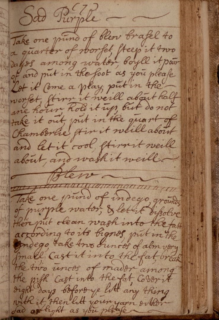
Two years ago, the Center for Virtual/Material Studies (CV/MS), housed in the Department of Art History at Penn State, approached the university’s Eberly Family Special Collections Library in hopes of creating an exhibition that would help launch the Center’s new research focus on textiles. The term “textiles” covers a lot of territory, of course, and narrowing the focus for the exhibition only became more difficult as we paged through many embroidery patterns, intricate weaving manuals, and upholstery sample books. Nothing seemed to coalesce until we considered a volume that had recently been rediscovered:[1] a receipt book written from 1697 to 1723 by Christian Barclay Jaffray, who was a daughter of one of the first Scottish Quaker families of Aberdeen (Fig. 1). Along with recipes for food and medications, her book assembled over sixty fascinating recipes for textile dyes.
Her recipes formed the core of our exhibition about the materials of dyes. We borrowed the first color term in our exhibition’s title from Barclay’s recipe for “Sad Purple” – a color which is less melancholy than it sounds, since in the early eighteenth century, “sad” often meant saturated. We drew our second color term, “mauve,” from the deep violet that the British chemist William Henry Perkin synthesized from coal-tar in the mid-nineteenth century. Visually similar, but in many ways antithetical, these two hues bracketed our display about dyes in a very long eighteenth century.
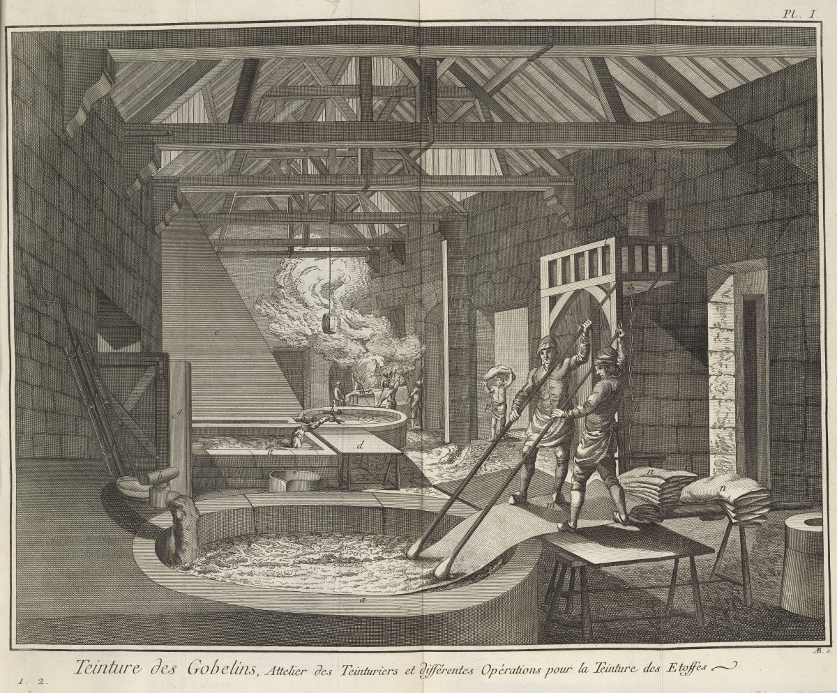
Dyes are an inherently interdisciplinary topic, reaching far beyond fashion and interior design. They have been entwined with histories of agriculture, medicine, and chemistry. They can be the product of domestic invention and tradition, as well as lucrative industry (Fig. 2). The story of dyes connects with stories of global trade, ecological destruction, colonial violence, incarceration, and human enslavement. From the start we knew that an exhibition like this would have to include expertise from many sectors of the university. We invited participation from scholars from around the university, connecting with the Departments of Agricultural Engineering, Art History, Entomology, History, Plant Science, Penn State’s Sheep Farm, the School of Visual Art, and the Theatre department’s Fashion Archive.
Because the Special Collections at Penn State, like collections at many American academic institutions, have been built on donations from collectors and tend to favor academic interests historically connected to privileged populations and institutional power, it was essential that we borrow additional objects and materials to expand beyond the Euro-American emphasis of the collections. To that end, the Matson Museum of Anthropology lent us fabric and copper utensils related to Indonesian batik from their collection. We devoted a vitrine to mud cloth centered around a Malian textile lent by a faculty member in African Studies and Art History. We also juxtaposed centuries-old objects with contemporary artists’ books that had been recently acquired by Special Collections in order to build more complex and affecting narratives about dyes in relation to gender, postcolonial identity, consumerism, and Blackness.
Finding textual materials that are exhibition worthy, i.e. visually engaging, requires many hours of requesting and then reviewing materials since catalog descriptions do not always provide enough information to assess the more visual elements of the materials, such as bindings, illustrations, prints, fabric swatches, let alone the shades and vividness of the colors of these elements. But once we settled on the right items, we included “realia” (objects from everyday life) to globalize, organize, and enliven our displays, as we paired books with the actual materials they addressed (Fig. 3).
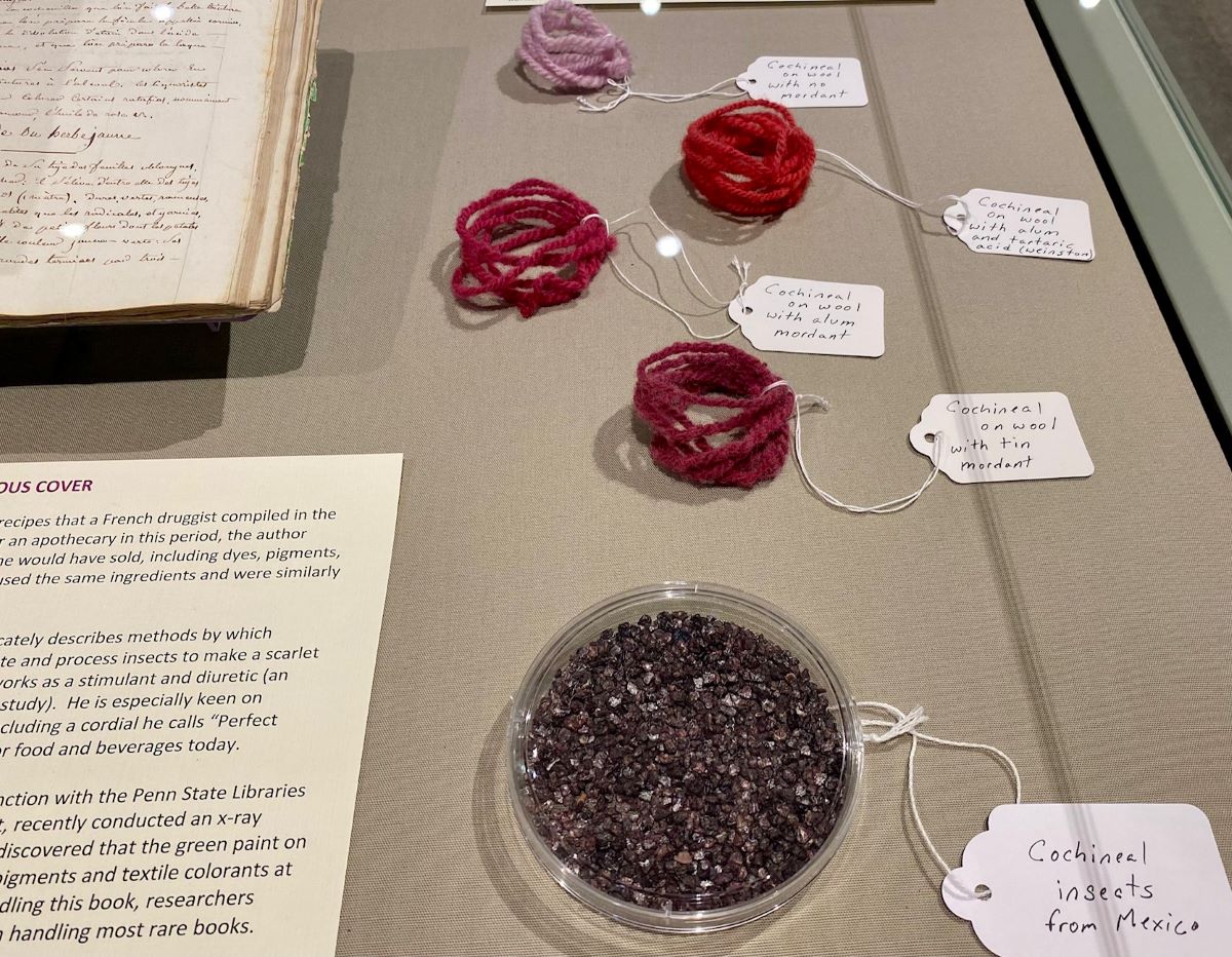
Next to Barclay’s recipe for Sad Purple we displayed the dye bath’s ingredients, which were a curious mixture of luxury and thrift. The winestone (tartaric acid crystals) with which Barclay raised the acidity of her decoction would have been harvested from empty casks of wine imported from France and Portugal (the winestone in our vitrine came from a Penn State librarian whose husband is a vintner). Our labels noted that the brazilwood in Sad Purple would have grown in South America and been exported to the Netherlands where it was likely to have been processed at a “rasphuis”–a prison where men grated dyewoods as part of their incarceration.[2] Through materials we recognized the long-term ecological consequences of dye culture, as when we explained that contemporary sappanwood would have to substitute for brazilwood in Sad Purple, because overharvesting of the tree in the eighteenth century (for dyes as well as violin bows) has put it on the endangered list.
Sometimes displaying the material helped us recover and form cultural narratives beyond the books themselves. In his influential Vegetable Materia Medica of 1817, the Pennsylvania-based naturalist William Barton noted that bloodroot (Sanguinaria canadensis) had been used as a dye among Indigenous people; he suggested that a marketable dye could be made from the plant, though it would only be economically viable with powerful mordants, since its orange color fades on most fibers. As a rejoinder to Barton’s description, we made a dye from bloodroot (better known as puccoon among the Lenape people) and noted that its color adheres enduringly, without mordant, to plant materials used in basketry that are high in the bio-polymer lingnin (Barton had not considered the application of dyes in the making of baskets).[3] We created a label just for the materials dyed with puccoon in order to elaborate on documented devotional practices among the Lenape that included pieces of the colorful root.
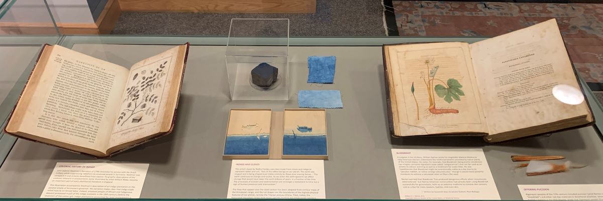
In his Narrative, of a Five Years’ Expedition… (1796), John Gabriel Stedman described egregious working conditions for enslaved people on an indigo plantation in Suriname. In our display case, we placed the 1796 book’s illustration of an indigo plant alongside Radha Pandey’s artist book, Deep Time (2017), in which silhouettes of mountain ranges in Asia and South America are dyed with indigo and clove in differing ratios to convey the shifting landscapes of the Anthropocene, with water levels rising in some parts of the world and receding in others (Fig. 4).
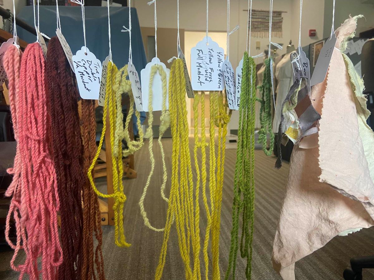
Throughout the planning process, we increasingly treated the exhibition as a catalyst and showcase for experimentation. We hosted collaborative events for making dyes featured in the exhibition: some dye workshops were exclusively for faculty and graduate students associated with the exhibition (Fig. 5); some were demonstrations as part of public lectures; and, on one occasion, the School of Visual Art’s Mobile Dye Unit was installed in front of the library to give passers-by an opportunity to try out some shibori techniques. Some of the colors we made came as a surprise. We were astonished to find that Christian Barclay’s recipe for “A True and Durable Copper Color” resulted in a very dark brown. Her recipe for “Wine” is madeira-like. The peach color that Barclay called “Maiden’s Blush” required nutritional yeast, aleppo oak wasp galls, kermes insects, and “good ole piss,” which we supplied, even though people with access to twenty-first century food, water, and pharmaceuticals are unlikely to produce the identical urine ingredient that Barclay called for. Ultimately, these experiments and re-workings allowed us the opportunity to explore the core interest of the exhibition—the historicity of color itself. What does it mean to recreate a color from the past? Is such a thing even possible? What is learned in the attempt?
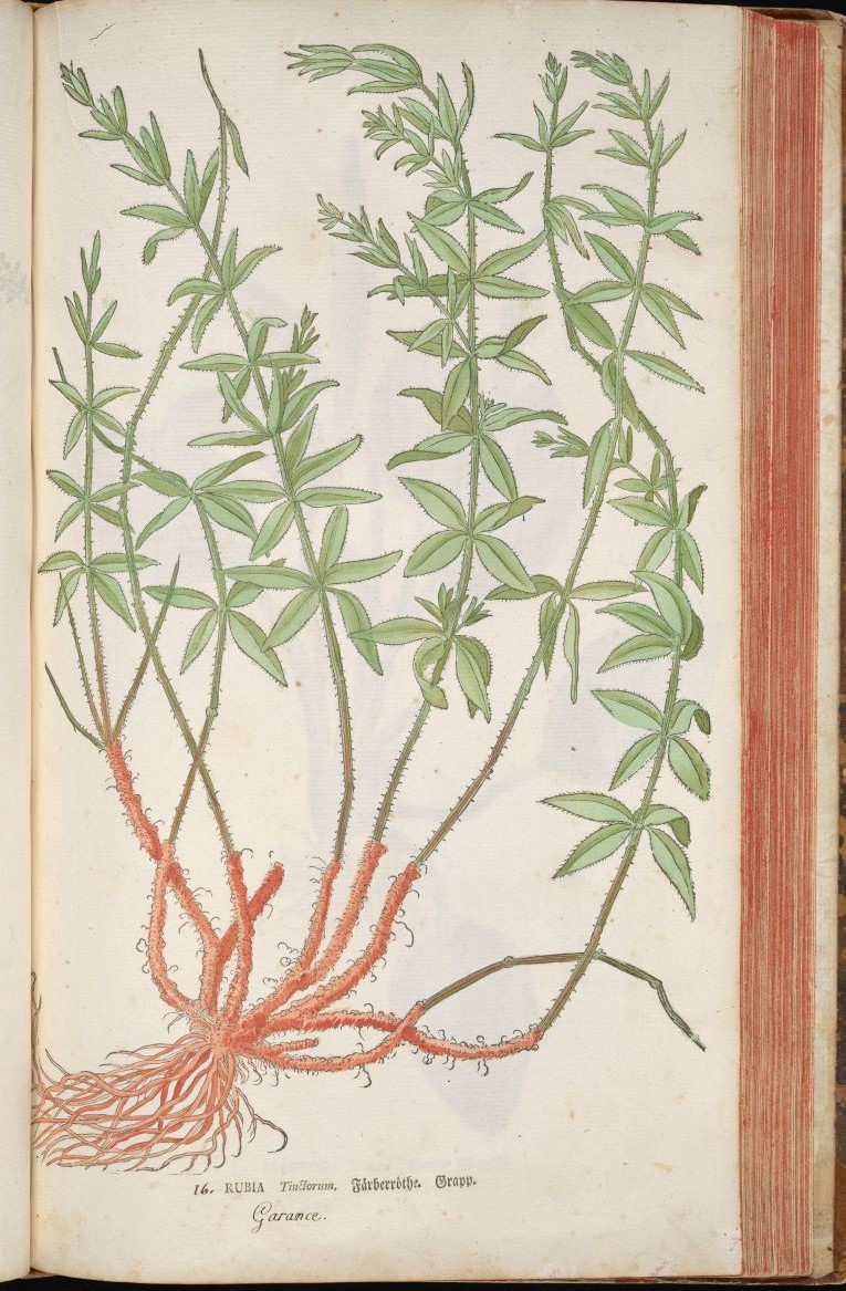
Some juxtapositions and recreations invited deeper consideration of the relationship between dye and its representation in imagery. In Salomon Schinz’s Anleitung zu der Pflanzenkenntniss (1774), the orange-red roots on the madder plant (familiar to us because we had grown madder in preparation for dye workshops) look to have been painted with a madder lake pigment (Fig. 6), which was also familiar because the Center for Visual/Material Studies had made lake pigment from madder dye baths produced in workshops. Color in this instance, then, was indexical: dye color of a madder plant was conveyed with a pigment derived from that very dyestuff. By contrast, the red ink used by Andō Hiroshige in his woodblock print of Narumi’s shibori district (1855, lent by the Palmer Museum of Art) does not correspond well to either of the red dyes common to the Japanese tie-and-dye process of shibori–madder or safflower. We dyed cloth and displayed the results next to the print, inviting viewers to account for differences in hue: perhaps red ink formulations did not allow for a good approximation of red dyes, or the ink changed color over time, or the project of matching ink color to textile was unnecessary because shibori did not involve a wide range of colors, and belaboring the specifics of hue beyond a heraldic “red” would be nonsensical.
Occasionally, dye materials asserted themselves on pages beyond the intentions of authors or even curators. When Penn State’s Senior Book Conservator, Bill Minter, began cleaning a catalog of coal-tar dyed swatches in preparation for our exhibition, we were astonished when he showed us how much coal dust had gathered on the pages, likely around the time the book was made. He agreed to leave the page only partially clean, so viewers could perceive the opposing chromatic effects of coal–the brilliance of new colors made available in the nineteenth century thanks to a substance that was at the same time coating every surface a dreary gray.
Library collections differ fundamentally from museum collections in that the materials on view are available for consultation in the reading room once the exhibition is over. While we had to decide which page or opening would be on view for visitors to the exhibition, the pages are meant to be turned. Every library exhibition is, in this way, a site of discovery and an invitation to touch, a laboratory for future historical research. Emphasizing the physical engagement that reading and material research requires in Special Collections, while also capitalizing on the sensuous pleasures of exploring fiber, textiles, and dyestuff, we created a Please Touch station where visitors could handle samples of material: a dish of cochineal insects for people to crush and smell, aleppo galls (especially appealing with their subtle peaks and matte surfaces), sticks of madder root, wool in various states of processing in preparation for dyeing, small samples of chintz, batik, shibori.
We are now returning to the book of Christian Barclay’s recipes that first got us started. Penn State’s Center for Visual/Material Studies is currently recreating each of the dyes in the hope that the cataloged results will document women’s achievements in chemical engineering and provide historians with a view onto, and insights into, chromatic environments of the eighteenth century. And the Eberly Family Special Collections library continues to make the manuscript available in the reading room and through its digital collections, so that future researchers can make their own discoveries.
Clara Drummond is Lead Curator and Exhibition Coordinator at the Eberly Family Special Collections Library at Penn State University
Sarah K. Rich is Associate Professor of Art History at Penn State and Director of the Center for Virtual/Material Studies
[1] Library colleagues digitized the manuscript, making it available online in 2021. The work of Professor Marissa Nicosia and Librarian Christina Reihman-Murphy at Penn State Abington, as well as Jonah Carver, a student at Penn State who transcribed the manuscript initially in support of the annual Great Rare Books Bake Off, was also foundational to the exhibition. Although Christian Barclay Jaffray’s A Receipt Book, or, The Fruits of a Young Woman’s Spare Hours was acquired by the library in 1999 as part of a purchase of a collection of documents related to her father, Robert Barclay, the manuscript had only recently been the subject of research, presumably due in part to the collection being under-described in the library’s catalog and the descriptive focus being on the writings of better-known male counterparts.
[2] For more context on the historical relationship between Dutch prisons and dye and pigment making, see Erma Hermens & A. Wallert, “The Pekstok Paper, Lake Pigments, Prisons and Paints-Mills,” The Study of Painting Techniques and Materials in support of Art Historical Research 11 (1998), 269-94.
[3] In fact a number of the colorants referenced in the books we displayed were for dyeing things besides textiles. In a lengthy passage about cochineal that appears in an apothecary’s notebook from 1824, the anonymous author says little about fabric, but notes that cochineal is a useful additive to redden popular drinks and toiletries, including “l’huile de parfait amour” (literally translated as “oil of perfect love”; “parfait amour” was the name of a traditional purple French liqueur).
Cite this note as: Clara Drummond and Sarah K. Rich, “Curators’ Notes: Sad Purple and Mauve: A History of Dye-Making,” Journal18 (July 2024), https://www.journal18.org/7378.
License: CC BY-NC
Journal18 is published under a Creative Commons CC BY-NC International 4.0 license. Use of any content published in Journal18 must be for non-commercial purposes and appropriate credit must be given to the author of the content. Details for appropriate citation appear above.